Saturday, 30 November 2013

Self Evaluation 1

Self Evaluation 1

This self evaluation is to show the progress I made with my front cover whilst trialing different mastheads.


Tuesday, 26 November 2013

Front Page Drafts

Front Page Drafts

Draft 1

I think the main image is suitable for the front cover because  the subject is looking indirectly at the camera and the background is neutral and not to busy, making it easy for text to be written over the top. The masthead is in a dark blue of a similar shade to the subjects dress, meaning they are in the colour scheme. However, the masthead doesn't stand out because of this, so to improve, I would use a different, maybe a neon colour, instead. I also think that the stencilled font makes the masthead stand out less, and for further improvement would use a more solid font.


Draft 2

This is the second draft. The changes that have been made includes the bright, neon pink colour for the masthead. It makes it stand out more than in the first draft because there is nothing else in the image of this colour and it also compliments the pink guitar. The font has also changed and is more solidified. The style, 'Chalkduster' also matches with the rough texture of the brick wall. It also fills the top bar of the front cover more effectively than in draft 1, again due to the font style.

Monday, 25 November 2013

Photography Shooting Script


Music Magazine Proposal

Music Magazine Proposal

This magazine is primarily aimed at 13-15 year old girls. In this issue, the main story is about a young Taylor Swift who is trying to break into the music industry, and has recently posted her new single on You Tube, and has already received over half a billion hits. The main image is going to show her innocence through the lack of make up and the bold outfits show her quirky personality. The letters that are written on her pink guitar show a time when she was just learning how to play. There would also be a top 20 dresses ad which would be advertised on the front page, accompanied by images of some dresses that are spread out. There is also a quiz, and a variety of other stories such as Top 10 Pop Fans and Top 10 Cringe Moments, both in 2013. The fonts that I shall be using are Apple Casual, Chalkduster, Hobo Std, Princetown LET and Tekton Pro. A combination of Hobo Std and Princetown LET will be used for the masthead, which is 'Delirium', and has connotations of words such as ecstasy and raving, which would reflect the teenagers emotions when listening to pop music. The masthead would be in an electric blue. The coverline would be written in Chalkduster to make it stand out more. Hobo Std wold be used for the smaller titles that will be in the left third. The remaining fonts will serve as the small print or quotes that accompany some titles. Other colours include orange, pink, white, black and yellow, as these colours were commonly used in research and previous covers that I've seen. 

Music Magazine Planning

Initial Ideas


Flatplan for the Front Cover


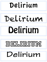
Draft Fonts for Masthead


On the left are mastheads that are only written in one of the five fonts that I have shortlisted to use on my front cover. The first and last one are a little plain on their own, and would not make the masthead stand out when it is on the shelves. The other three are bolder and are slightly more interesting and different. The mastheads on the right are mixtures of the fonts, and I've also experimented with tilting the letters to see what effect this would have. My current decision is that the second one down on the right would make a suitable masthead because both fonts are bold, and the 'D' stands out more. 

Test Photography

 This image shows how diagonal lines can be used to focus on the main subject. The perpendicular angle of the guitar to the subject draws attention to her.


This image shows the rules of thirds, as the subjects face is in the right hand side of the image and is about 2/3 up the page.


The impression of looking up at the subject suggests how she is rising to fame and moving on from the 'bedroom' stage. It also shows how confident she is in what she is doing.


Photography Techniques

Photography Techniques

The Rule of Thirds

  • Based on the the fact that the human eye is naturally drawn to a point about 2/3 up a page
  • The rule suggests the photo will be more pleasing to the eye if the focal points are located around one of the intersection points.


Diagonal Lines

  • Draw the eye of the viewer through the photography
  • Create points of interest as they intersect with other lines and often give images depth by suggesting perspective
  • Add a sense of action and a dynamic look and feel


Band/Artist Photography

How can the rule of third be applied to this image?
The two people in the background are in line with the top third intersection points.

Tuesday, 12 November 2013

Pop Music Target Audience Task 2

Questionnaire

For this second task, and to get a more in-depth opinion from my target audience, I created a questionnaire to which 10 people responded too and these are the results:
All of the following participants read music magazines on a weekly to monthly basis.


From these results, I have concluded that the majority, 80%, mainly listen to pop music, which implies that, for my target audience, pop music is the first choice, making a pop music magazine relevant, as it has a market to be sold too. The most important aspect of a music magazine, according to this sample group, is the gossip section, followed by interviews and reviews. In my magazine, there is a gossip section and review of the latest dress fashions, as well as and interview with a rising star, making it fit the expectations of this particular sample group. The high expectation of gossip could be explained by the dominance of females who answered this questionnaire, as 60% of the recipients were females. The pie chart also shows that the majority of people who answered my questionnaire were within my target age group of 12 upwards.