Initial Ideas
Flatplan for the Front Cover

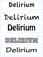
On the left are mastheads that are only written in one of the five fonts that I have shortlisted to use on my front cover. The first and last one are a little plain on their own, and would not make the masthead stand out when it is on the shelves. The other three are bolder and are slightly more interesting and different. The mastheads on the right are mixtures of the fonts, and I've also experimented with tilting the letters to see what effect this would have. My current decision is that the second one down on the right would make a suitable masthead because both fonts are bold, and the 'D' stands out more.
Test Photography
This image shows how diagonal lines can be used to focus on the main subject. The perpendicular angle of the guitar to the subject draws attention to her.
This image shows the rules of thirds, as the subjects face is in the right hand side of the image and is about 2/3 up the page.
The impression of looking up at the subject suggests how she is rising to fame and moving on from the 'bedroom' stage. It also shows how confident she is in what she is doing.


No comments:
Post a Comment