Developments of the Contents Page
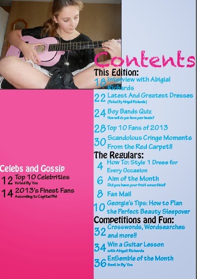
The first stage of developing the page involved putting in a light blue column and an image of the main subject, Abigail Richards, in the top left hand corner, ensuring that they overlap. The title is written in Chalkduster and is the same colour as the masthead on the front page. The sub-headlines of the page will be written in black so that they will stand out against the background. The page numbers and titles are currently written in a light blue, which again matches the colour scheme on the front page.
More article title and categories have been added in the light blue column. A second column has also been added to accommodate more article titles and also divides them systematically, rather than in one chunk, which readers may find overwhelming. I plan to add an image in the middle of the two columns to give one of the articles more of an image on what to expect, as well as to be within design specifications. The articles are also being ordered according to their category, instead of in chronological order, so readers only look at the sections they find more important.
The titles in the light blue column have been completed and all text is visible, making it easy for the readers to read it. The column on the left is primarily going to contain images, as well as the articles for the Celebs and Gossip section of the magazine.
In this draft, I changed the position of the article title at the top of the contents page so that it did not overlap with the picture, making it more visible and easier to read, especially because it is the feature article.
The final article has been added to the Celebs and Gossip section. It also includes heart bullet points like the ones on the front cover. I plan to add a couple more images before finalising this design.
In this draft, there are three own images on this page, one of which (the envelope) was designed by myself in Photoshop, was saved as a PNG and was meant to illustrate the Fan Mail article. The other two images were also photographed by myself. The Celebs and Gossip section was moved upwards in order to accommodate the portrait image of EnSemble of the Month. This page continues with the colour scheme of the front cover and this will further spread into the double page spread.
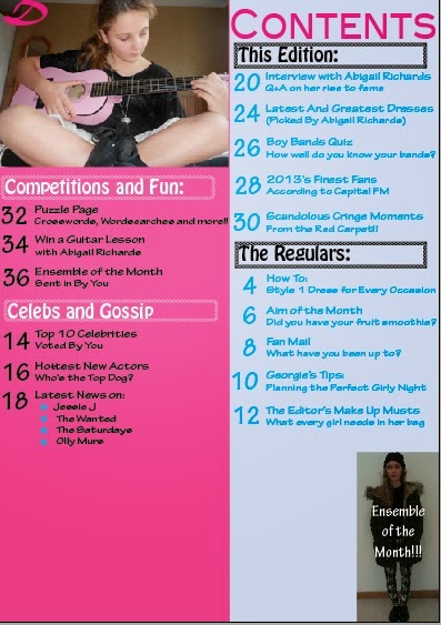
There has not been as much change on the contents page compared to the front cover, however, after I printed it out, I realised that the font was too big when compared to a traditional magazine. I therefore started out by making all of the font smaller, and this led to having to reorganise the page. This left me with more room, especially when I got rid of the envelope, as it looked extremely amateur. The sub-headlines were given borders to make them look more organised. The 'Ensemble of the Month' image was moved to the bottom right hand corner, again to save room, with the text directly over the outfit. The signature 'D' has been added to the smaller image of Abigail in the top left corner. I now needed something to fill the gap. After doing some additional research, I decided on an editor note and some of the journalists to be mentioned.
The final addition of the editors note and short messages from some of the journalists makes the magazine more conventional looking. It also makes the target audience feel more included in the creation of the magazine, which is what the editor is thanking them for. Furthermore, all of the articles have a small tagline underneath and are equally spaced out.
More article title and categories have been added in the light blue column. A second column has also been added to accommodate more article titles and also divides them systematically, rather than in one chunk, which readers may find overwhelming. I plan to add an image in the middle of the two columns to give one of the articles more of an image on what to expect, as well as to be within design specifications. The articles are also being ordered according to their category, instead of in chronological order, so readers only look at the sections they find more important.
The titles in the light blue column have been completed and all text is visible, making it easy for the readers to read it. The column on the left is primarily going to contain images, as well as the articles for the Celebs and Gossip section of the magazine.
In this draft, I changed the position of the article title at the top of the contents page so that it did not overlap with the picture, making it more visible and easier to read, especially because it is the feature article.
The final article has been added to the Celebs and Gossip section. It also includes heart bullet points like the ones on the front cover. I plan to add a couple more images before finalising this design.
In this draft, there are three own images on this page, one of which (the envelope) was designed by myself in Photoshop, was saved as a PNG and was meant to illustrate the Fan Mail article. The other two images were also photographed by myself. The Celebs and Gossip section was moved upwards in order to accommodate the portrait image of EnSemble of the Month. This page continues with the colour scheme of the front cover and this will further spread into the double page spread.
The final addition of the editors note and short messages from some of the journalists makes the magazine more conventional looking. It also makes the target audience feel more included in the creation of the magazine, which is what the editor is thanking them for. Furthermore, all of the articles have a small tagline underneath and are equally spaced out.


No comments:
Post a Comment