Development of the Double Page Spread
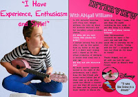
In my initial ideas, I am confident that using just one large image and a single quote is conventional of this magazine industry. The pink background on the right is to help match the colour scheme of the contents page and front page, and is a slightly lighter shade to make reading easier for the audience. I've also used the InDesign programme to put in 2 columns in order to make the text layout more conventional.I've extended the blue background so that it not only covers the quote, but also the image of Abigail Richards. I also changed the font colour to pink and put emphasis on the first letter of each word. The right hand side has been given a title in the Princetown STD font, along with 'With Abigail Williams' in light blue to keep with the colour scheme.
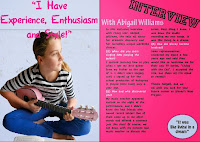
I have now added text and have finished the article, keeping it short and concise so that it is conventional. I have also created a plug to put in the lower right hand corner in order to fill the space. I also plan to add the logos of Disney and Lightning Records (which I'll be making myself).
The logos have been added.

I've also added an edited image of Abigail Richards writing one of her songs.
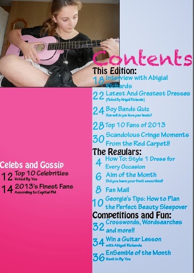
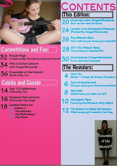
In this final contents page, I realised an error, as I've previously been calling her Abigail Williams, instead of Abigail Richards. This confusion stems from a play I read for my GCSE's, in which the main character is called Abigail Williams.
Again, after printing out the first draft, I realised the font was too big when compared to other magazines, so, like the contents page, I had to make the font smaller. I also decided on a 3 column layout, as it looks more conventional. This also led to me having to make the article significantly longer than it was previously. I also switched the positions of 'Interview' and Abigail's main quote. This is because it is now more conventionally laid out. The smaller quotes have been placed randomly around the two page spread so that it is not too uniform in appearance. I also got rid of the Lightning Productions logo, as it looks very fake, and not conventional of a magazine.
In this final draft, I have added the symbolic 'D' and have reorganised the other three images that had accompanied the Lightning Productions logo. The main quote has been made the headline and a part of the coverline that was originally on the front cover, has been moved to become the introductory statement to the article. Page numbers have also been added, as well as odd shapes in the corners in order to tie the colour scheme together more effectively.


