Tuesday, 18 March 2014
Q6) What have you learnt about technologies from the process of constructing this product?
Strengths
 Using the program InDesign gives designers a wide variety of fonts and way to adjust fonts, such as making the letters wider or increasing the gap between letters. There is also a vast combination of colours so the design can be personalised. I've also learned that the use of the internet in order to research the industry and to view designs that already exist is also useful. Furthermore, I've also used programs such as PhotoShop and FireWorks to edit my own images. This came in useful, as I often had to erase the background or crop the image. I've also progressed from my original skills audit, when I had no experience on the Mac, and had to learn how to use a whole different computer system. Now the only sections I am unable to complete are scanning images into the Mac. This is because I never had to do this. I've also developed my camera skills.
Weaknesses
 The first problem that I faced was learning how to use InDesign, as I had no previous experience with the programme, or using a Mac. I feel that I have overcome this in the process of making my music magazine, as I've had to learn how to make effective shapes and prioritise the large amount of fonts. For example, in 'Pupil Paper', I knew that, because of my lack of experience with InDesign, I could not create the shapes that I wanted, and was therefore limited to rectangles, circles and hexagons. By the time I completed my double page spread, I was using triangles and could more adequately shape text within shapes to make it the most effective.
Another weakness that I had at the beginning was learning how to use Blogger effectively to showcase my work. It took me a while to decide how my coursework would be laid out, but I eventually developed a style I was comfortable with.
Opportunities
I've learned how to use the majority of the Adobe programs. I've also developed my camera skills, and have been able to take effective images.
I've learned how to use the majority of the Adobe programs. I've also developed my camera skills, and have been able to take effective images.
Threats
When I initially started the coursework, I had to get used to a lot of new programs within one lesson. I had to be shown a lot of the techniques a few times before I understood it correctly.
When I initially started the coursework, I had to get used to a lot of new programs within one lesson. I had to be shown a lot of the techniques a few times before I understood it correctly.
Q2) How does your media product represent particular social groups?
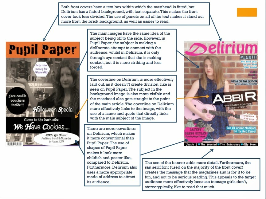
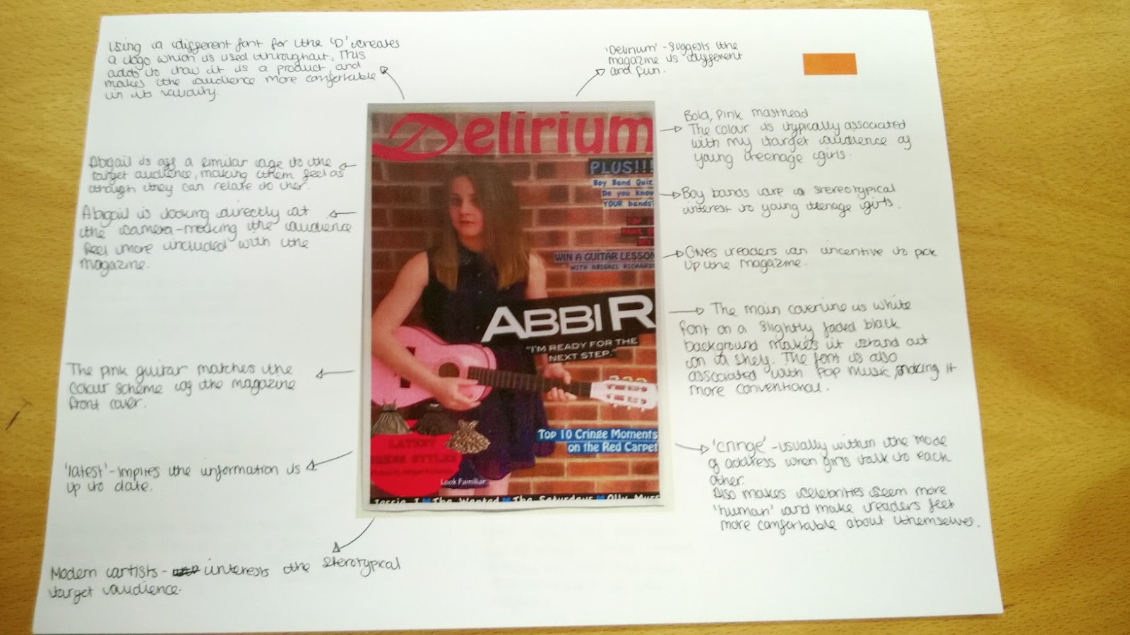
My target audience are teenage girls over the age of 14. As such, the magazine follows typical teenage girl conventions in a pop magazine. This includes an advertisement of clothes, a quiz of some description, usually either testing their knowledge of something or to help them discover what kind of guy would suit them. The colour scheme of pink, baby blue, white and black are quite feminine colours, and the backgrounds are usually block colours, so that the text is easy to read. The models used are within the target audience age, and are dressed fashionably in order to encourage readers to dress similarly. In addition, the 'celebrity' being interviewed is also offering fashion advice. Abigail also never looks at the camera directly, giving some hints of modestly that readers should try to replicate. The simple colour scheme also reflects how their own wardrobe should be simple and fit a single style, instead of being varied. The colour scheme is very feminist, with baby blue and pink, showing that readers are very 'girly' and are completely stereotypical of the age I'm targeting. There are also ways for the audience to influence the magazine, such as the Ensemble of the Month competition and the Fan Mail section. This will keep readers occupied, with something different every month. It will also advertise the appropriate style that the readers should be following, because they are reading this magazine. In the general media, teenage girls are often portrayed to be one of two extremes. There are the intelligent girls who care about there education, and are normally not socially accepted. The other group are the girls that only care about their appearance and getting social acceptance, using through boyfriends and being anti-school. There are an increasing number of teenage girls taking their own life through events that take place on social media sites, the most recent case being 15 year old Tallulah Wilson, who killed herself towards the end of January 2014. When I searched 'teenage girls' on the Daily Mail website, the most relevant articles were mainly related to the many health problems that teenage girls face, making them appear very vulnerable to the mass audience. On the BBC News website, when I typed the same thing in, the main stories were about sex offenders, health and eating disorders that affect young teenage girls. On the Guardian website, the main articles were about how teenage girls are groomed by society, and their opinion on certain pop stars such as Miley Cyrus. The main theme, and therefore representation is one of vulnerability and the easiness of convincing young teenagers to do something that they wouldn't normally do. They are seen as weak and unable to take care of themselves.
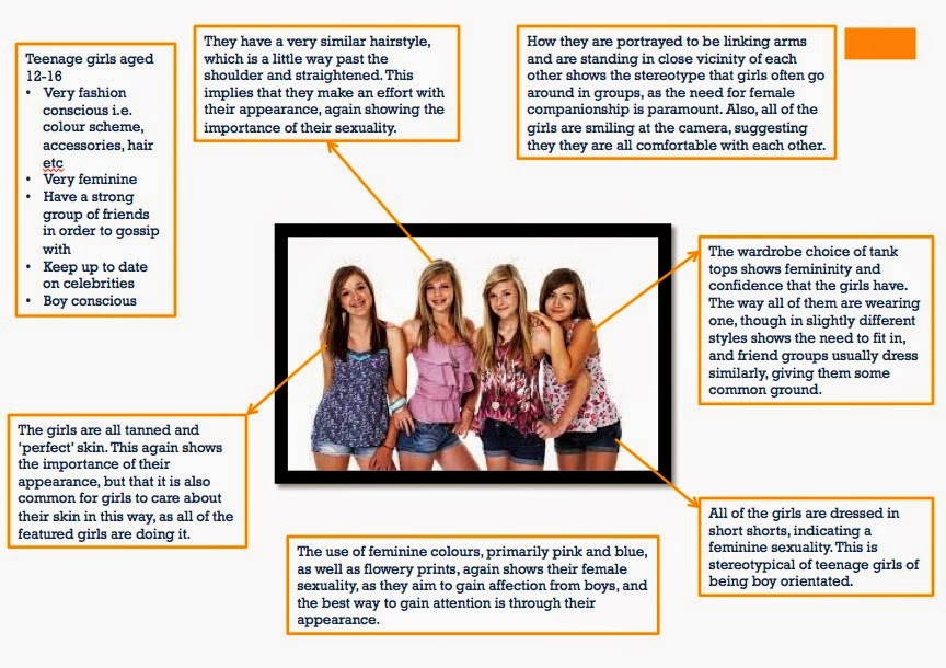
 In this image (From the Guardian article Sex, Lies and Teenage Girls), all of the pictured girls are seen to have the same style of clothing (short shorts, t-shirts and flip-flops), the same hairstyle and all of them on their mobile phones. This shows them to be detached from the real world. To counter this sexual stereotype in my magazine, the photography shows Abigail to be modestly dressed in comparison. This shows the responsibility I feel towards my target audience of teenage girls that they do not have to wear revealing clothes in order to be accepted into society. My photography therefore shows a more positive side to a teenage girls wardrobe.
 In this image (From the Guardian article Sex, Lies and Teenage Girls), all of the pictured girls are seen to have the same style of clothing (short shorts, t-shirts and flip-flops), the same hairstyle and all of them on their mobile phones. This shows them to be detached from the real world. To counter this sexual stereotype in my magazine, the photography shows Abigail to be modestly dressed in comparison. This shows the responsibility I feel towards my target audience of teenage girls that they do not have to wear revealing clothes in order to be accepted into society. My photography therefore shows a more positive side to a teenage girls wardrobe.
Tuesday, 14 January 2014
Development of the Double Page Spread
Development of the Double Page Spread
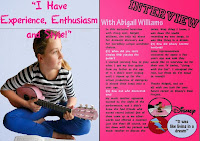
In my initial ideas, I am confident that using just one large image and a single quote is conventional of this magazine industry. The pink background on the right is to help match the colour scheme of the contents page and front page, and is a slightly lighter shade to make reading easier for the audience. I've also used the InDesign programme to put in 2 columns in order to make the text layout more conventional.I've extended the blue background so that it not only covers the quote, but also the image of Abigail Richards. I also changed the font colour to pink and put emphasis on the first letter of each word. The right hand side has been given a title in the Princetown STD font, along with 'With Abigail Williams' in light blue to keep with the colour scheme.
I have now added text and have finished the article, keeping it short and concise so that it is conventional. I have also created a plug to put in the lower right hand corner in order to fill the space. I also plan to add the logos of Disney and Lightning Records (which I'll be making myself).
The logos have been added.
I've also added an edited image of Abigail Richards writing one of her songs.
In this final contents page, I realised an error, as I've previously been calling her Abigail Williams, instead of Abigail Richards. This confusion stems from a play I read for my GCSE's, in which the main character is called Abigail Williams.
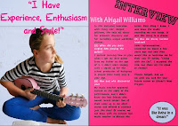
Again, after printing out the first draft, I realised the font was too big when compared to other magazines, so, like the contents page, I had to make the font smaller. I also decided on a 3 column layout, as it looks more conventional. This also led to me having to make the article significantly longer than it was previously. I also switched the positions of 'Interview' and Abigail's main quote. This is because it is now more conventionally laid out. The smaller quotes have been placed randomly around the two page spread so that it is not too uniform in appearance. I also got rid of the Lightning Productions logo, as it looks very fake, and not conventional of a magazine.
In this final draft, I have added the symbolic 'D' and have reorganised the other three images that had accompanied the Lightning Productions logo. The main quote has been made the headline and a part of the coverline that was originally on the front cover, has been moved to become the introductory statement to the article. Page numbers have also been added, as well as odd shapes in the corners in order to tie the colour scheme together more effectively.
Monday, 13 January 2014
Monday, 6 January 2014
Development of the Contents Page
Developments of the Contents Page
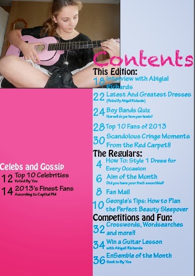
The first stage of developing the page involved putting in a light blue column and an image of the main subject, Abigail Richards, in the top left hand corner, ensuring that they overlap. The title is written in Chalkduster and is the same colour as the masthead on the front page. The sub-headlines of the page will be written in black so that they will stand out against the background. The page numbers and titles are currently written in a light blue, which again matches the colour scheme on the front page.
More article title and categories have been added in the light blue column. A second column has also been added to accommodate more article titles and also divides them systematically, rather than in one chunk, which readers may find overwhelming. I plan to add an image in the middle of the two columns to give one of the articles more of an image on what to expect, as well as to be within design specifications. The articles are also being ordered according to their category, instead of in chronological order, so readers only look at the sections they find more important.
The titles in the light blue column have been completed and all text is visible, making it easy for the readers to read it. The column on the left is primarily going to contain images, as well as the articles for the Celebs and Gossip section of the magazine.
In this draft, I changed the position of the article title at the top of the contents page so that it did not overlap with the picture, making it more visible and easier to read, especially because it is the feature article.
The final article has been added to the Celebs and Gossip section. It also includes heart bullet points like the ones on the front cover. I plan to add a couple more images before finalising this design.
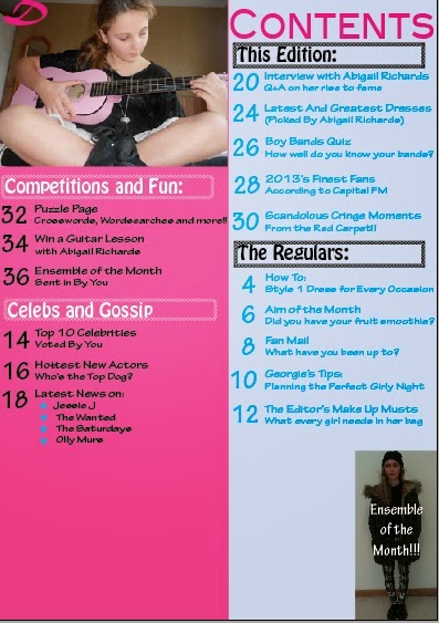
In this draft, there are three own images on this page, one of which (the envelope) was designed by myself in Photoshop, was saved as a PNG and was meant to illustrate the Fan Mail article. The other two images were also photographed by myself. The Celebs and Gossip section was moved upwards in order to accommodate the portrait image of EnSemble of the Month. This page continues with the colour scheme of the front cover and this will further spread into the double page spread.
There has not been as much change on the contents page compared to the front cover, however, after I printed it out, I realised that the font was too big when compared to a traditional magazine. I therefore started out by making all of the font smaller, and this led to having to reorganise the page. This left me with more room, especially when I got rid of the envelope, as it looked extremely amateur. The sub-headlines were given borders to make them look more organised. The 'Ensemble of the Month' image was moved to the bottom right hand corner, again to save room, with the text directly over the outfit. The signature 'D' has been added to the smaller image of Abigail in the top left corner. I now needed something to fill the gap. After doing some additional research, I decided on an editor note and some of the journalists to be mentioned.
The final addition of the editors note and short messages from some of the journalists makes the magazine more conventional looking. It also makes the target audience feel more included in the creation of the magazine, which is what the editor is thanking them for. Furthermore, all of the articles have a small tagline underneath and are equally spaced out.
More article title and categories have been added in the light blue column. A second column has also been added to accommodate more article titles and also divides them systematically, rather than in one chunk, which readers may find overwhelming. I plan to add an image in the middle of the two columns to give one of the articles more of an image on what to expect, as well as to be within design specifications. The articles are also being ordered according to their category, instead of in chronological order, so readers only look at the sections they find more important.
The titles in the light blue column have been completed and all text is visible, making it easy for the readers to read it. The column on the left is primarily going to contain images, as well as the articles for the Celebs and Gossip section of the magazine.
In this draft, I changed the position of the article title at the top of the contents page so that it did not overlap with the picture, making it more visible and easier to read, especially because it is the feature article.
The final article has been added to the Celebs and Gossip section. It also includes heart bullet points like the ones on the front cover. I plan to add a couple more images before finalising this design.
In this draft, there are three own images on this page, one of which (the envelope) was designed by myself in Photoshop, was saved as a PNG and was meant to illustrate the Fan Mail article. The other two images were also photographed by myself. The Celebs and Gossip section was moved upwards in order to accommodate the portrait image of EnSemble of the Month. This page continues with the colour scheme of the front cover and this will further spread into the double page spread.
The final addition of the editors note and short messages from some of the journalists makes the magazine more conventional looking. It also makes the target audience feel more included in the creation of the magazine, which is what the editor is thanking them for. Furthermore, all of the articles have a small tagline underneath and are equally spaced out.
Saturday, 4 January 2014
Contents Page Annotation
Contents Page Annotation
The main headlines are in a column on the right hand side of the page and are separated into three categories: Features, Interviews and The Usual Suspects. There is also a smaller column on the left hand side 2/3 of the way down labelled Gear. There are 4 images of key people who are featured in the magazine. All of there images are medium/long shots and all are holding a guitar, following the theme of the magazine.
Subscribe to:
Comments (Atom)
