Monday, 9 December 2013

Development of the Front Cover

Development of the Front Cover

This evaluation is on my second lesson allocated for my front cover.

Beginning of the Lesson

S.M.A.R.T  target: Complete at least two coverlines and pull quotes.

Progress throughout the Lesson

 My first dilemma was decided what colour combination to make my coverline/pull quote. This is important because it has to stand out among the other titles because it is the main story.


These were the first three colour combinations I trialled. I did not select any of these because the white on black combination stands out more.

This screenshot shows the coverline I selected and I have started to add the left third. The coverline has a pull quote "I'm ready for the next step" and has a variety of fonts at a variety of sizes so that more emphasis is placed on her name and the quote.


In this screenshot, I've added another title to the left third.

At this stage, I've added on plugs and puffs, containing more content of the magazine.


This is the first draft for the front cover. The cut out dresses and layout of the main coverline are good. To improve, I'm going to remove the yellow and orange font in favour of a blue, pink, black and white colour scheme which will run throughout the entire magazine. The dresses are going to be moved to the top right third so that the guitar is visible. The font of the masthead is also going to be changed so that it is bolder.


This is the second draft for the front cover. The movement of the dresses makes the guitar more visible, showing that it is a music magazine. The font of the masthead stand out more and the 'Chalkduster' font is more suited to the coverline, and making the pull quote and her name stand out more.


Since the third draft, my lecturer has advised me to make some changes. As such, I have added the white banner and lowered the main subject image to admit the banner to make the masthead stand out more and to prevent obstruction to the image.


For the forth draft I have added a banner at the bottom of the page because it looked bare compared to the rest of the page. It contains popular artists from the genre research, including Olly Murs and Jessie J. I have added small blue hearts onto the banner at the bottom using photoshop to design and colour it.


In this draft, I have made many changes to the front cover after I printed off the front cover in order to get a more accurate view so that I could gauge how conventional it was. The background image was changed in order to make Abigail look older and to have an elongated brick background, so that the semi-transparent masthead banner could be put in without making Abigail smaller. The first letter of the masthead has been changed so that it can be made into a logo that is placed on all of the pages of my magazine. The coverline has also been significantly shortened and the font has been changed, again to give the magazine a more professional appearance. The layout of the dresses have also been changed so that they are centred around a circular text box, as it makes it take up less room, and also makes it look more professional. I've kept the same colour scheme throughout and have also kept the majority of my original fonts.

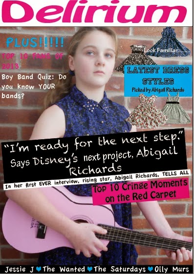
This is the final front cover design. I have added more plugs in the  way of more coverlines. There is a mix of colours and fonts in order to keep it varied. The reason this is on the right hand side instead of the traditional 'left third' is because of the pose of Abigail, and placing all of the smaller coverlines would obscure her pose, as well as leaving a vast area of empty space. I have also adopted the use of semi-transparent backgrounds for the majority of the texts as it not only incorporates the colour scheme more effectively, but also makes the text easier to read against the brick background, something that I struggled with previously. There is no barcode because it would be on the back page of the magazine in order to save space.

Saturday, 30 November 2013

Self Evaluation 1

Self Evaluation 1

This self evaluation is to show the progress I made with my front cover whilst trialing different mastheads.


Tuesday, 26 November 2013

Front Page Drafts

Front Page Drafts

Draft 1

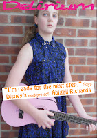
I think the main image is suitable for the front cover because  the subject is looking indirectly at the camera and the background is neutral and not to busy, making it easy for text to be written over the top. The masthead is in a dark blue of a similar shade to the subjects dress, meaning they are in the colour scheme. However, the masthead doesn't stand out because of this, so to improve, I would use a different, maybe a neon colour, instead. I also think that the stencilled font makes the masthead stand out less, and for further improvement would use a more solid font.


Draft 2

This is the second draft. The changes that have been made includes the bright, neon pink colour for the masthead. It makes it stand out more than in the first draft because there is nothing else in the image of this colour and it also compliments the pink guitar. The font has also changed and is more solidified. The style, 'Chalkduster' also matches with the rough texture of the brick wall. It also fills the top bar of the front cover more effectively than in draft 1, again due to the font style.

Monday, 25 November 2013

Photography Shooting Script


Music Magazine Proposal

Music Magazine Proposal

This magazine is primarily aimed at 13-15 year old girls. In this issue, the main story is about a young Taylor Swift who is trying to break into the music industry, and has recently posted her new single on You Tube, and has already received over half a billion hits. The main image is going to show her innocence through the lack of make up and the bold outfits show her quirky personality. The letters that are written on her pink guitar show a time when she was just learning how to play. There would also be a top 20 dresses ad which would be advertised on the front page, accompanied by images of some dresses that are spread out. There is also a quiz, and a variety of other stories such as Top 10 Pop Fans and Top 10 Cringe Moments, both in 2013. The fonts that I shall be using are Apple Casual, Chalkduster, Hobo Std, Princetown LET and Tekton Pro. A combination of Hobo Std and Princetown LET will be used for the masthead, which is 'Delirium', and has connotations of words such as ecstasy and raving, which would reflect the teenagers emotions when listening to pop music. The masthead would be in an electric blue. The coverline would be written in Chalkduster to make it stand out more. Hobo Std wold be used for the smaller titles that will be in the left third. The remaining fonts will serve as the small print or quotes that accompany some titles. Other colours include orange, pink, white, black and yellow, as these colours were commonly used in research and previous covers that I've seen. 

Music Magazine Planning

Initial Ideas


Flatplan for the Front Cover


Draft Fonts for Masthead


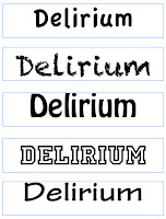
On the left are mastheads that are only written in one of the five fonts that I have shortlisted to use on my front cover. The first and last one are a little plain on their own, and would not make the masthead stand out when it is on the shelves. The other three are bolder and are slightly more interesting and different. The mastheads on the right are mixtures of the fonts, and I've also experimented with tilting the letters to see what effect this would have. My current decision is that the second one down on the right would make a suitable masthead because both fonts are bold, and the 'D' stands out more. 

Test Photography

 This image shows how diagonal lines can be used to focus on the main subject. The perpendicular angle of the guitar to the subject draws attention to her.


This image shows the rules of thirds, as the subjects face is in the right hand side of the image and is about 2/3 up the page.


The impression of looking up at the subject suggests how she is rising to fame and moving on from the 'bedroom' stage. It also shows how confident she is in what she is doing.


Photography Techniques

Photography Techniques

The Rule of Thirds

  • Based on the the fact that the human eye is naturally drawn to a point about 2/3 up a page
  • The rule suggests the photo will be more pleasing to the eye if the focal points are located around one of the intersection points.


Diagonal Lines

  • Draw the eye of the viewer through the photography
  • Create points of interest as they intersect with other lines and often give images depth by suggesting perspective
  • Add a sense of action and a dynamic look and feel


Band/Artist Photography

How can the rule of third be applied to this image?
The two people in the background are in line with the top third intersection points.

Tuesday, 12 November 2013

Pop Music Target Audience Task 2

Questionnaire

For this second task, and to get a more in-depth opinion from my target audience, I created a questionnaire to which 10 people responded too and these are the results:
All of the following participants read music magazines on a weekly to monthly basis.


From these results, I have concluded that the majority, 80%, mainly listen to pop music, which implies that, for my target audience, pop music is the first choice, making a pop music magazine relevant, as it has a market to be sold too. The most important aspect of a music magazine, according to this sample group, is the gossip section, followed by interviews and reviews. In my magazine, there is a gossip section and review of the latest dress fashions, as well as and interview with a rising star, making it fit the expectations of this particular sample group. The high expectation of gossip could be explained by the dominance of females who answered this questionnaire, as 60% of the recipients were females. The pie chart also shows that the majority of people who answered my questionnaire were within my target age group of 12 upwards.

Pop Music Target Audience Part 1

Pop Music Target Audience

Pop music fans cover thousands of people on a global scale. Capital FM released an article earlier this year titled 'Best Music Fans of 2013', which collected the top ten fan bases on the planet for pop artists.
  1. Directioners (One Direction)
  2. Soldiers (Cheryl Cole)
  3. TWFanmily (The Wanted)
  4. Mus Army (Olly Murs)
  5. Beliebers (Justin Beiber)
  6. Alouders (Girls Aloud)
  7. JLSters (JLS)
  8. Heartbeats (Jessie J)
  9. Rihanna Navy (Rihanna)
  10. KatyCats (Kary Perry)

Typical pop fans seem to have a strong sense of loyalty to their favourite artists, which leads to the creation of communities of people who sees themselves as the top fans.


Surve
As established in the first research task, there are two main groups of people that pop music magazines aim for. They are the 20's through to 30's and the teenage girl audience. Through this research, I have come to the conclusion that my target audience will be teenagers. This is because myself and all of my friends are teenagers, and it will be easier to get feedback on my work. I also feel I can incorporate my own ideas more so than if I was targeting the older audience because of the use of colour and fonts I plan to use.

Survey of 11-15 Year Olds

Survey Plan
  1.  How old are you? 11 and under, 11,12,13,14,15, 15 and over
  2. Are you male or female?
  3. Do you read pop music magazines?
  4. If so , which one/s?
  5. Which genre of music do you most listen to? Pop, Rock, Country, Hip Hop, R+B, Soul, Other
  6. Who is your favourite artist?
  7. What do you expect from a pop music magazine? Gossip, Interviews, Reviews, Freebies, Fashion Tips, Other

Monday, 11 November 2013

Pop Music Magazine Research Task 2

Codes and Conventions of Pop Music Videos

I feel that this research is relevant as it could influence the mood of the final magazine (i.e. colour schemes, fonts, artist used, theme, plugs and puffs).
  • Close up of artists
  • Fun and innocent
  • Normally centred around a plot (e.g. a girl has a crush on a boy), this normally includes a narrative before the song starts
  • Dance routines 
  • Colourful
  • Cheerful location (e.g. party, beach)

Codes and Conventions of Pop Music Artists

This research could affect the colour scheme of the final magazine because it would reflect the mood of the general genre and model I'll be using to be in my main image.
  • Artists are clothed in fashionable and mainstream outfits
  • The lyrics are normally based on love/relationships and normally relate to teens
  • Often themed with bright and bold colours which reflects a positive vibe

Pop Music Magazine Research Task 1

Tuesday, 5 November 2013

Music Magazine Introduction

Music Magazine Introduction

Music Genres and Sub Genres Mind-map


Connotations of Mastheads

Metal Hammer - Suggests strength and construction.
Kerrang - Implies something different
Downbeat - Suggests relaxation and slow
Busy Signal - Implies the music is busy and has many different aspects and sounds
Billboard - The music is quite communal and public
Vibe - The latest music and that there is a rhythm to it
Beatz - Best music and the genre has rhythm
The Source - It has the latest information and is the main source of information

Define Target Audience

The people that the magazine is aimed to attract.

Audience Profiles

Pop Listeners

The typical wardrobe includes short shorts, sunglasses, sleeveless cardigans and wellington boots, with bracelets, necklaces and other jewellery. The audience is also typically teenage girls who attend concerts and festivals. They also often have certain favourite artists that they specifically support. They all look the same and follow the same trends. e.g. the high socks with wellingtons and shorts, as well as the floral headbands.


Classical Listeners

This image shows the men wearing formal black tie suits whilst the women are wearing elegant, floor length dresses with there hair away from their faces and wearing extravagant necklaces and earrings. The audience also generally consists of middle aged to elderly people. The men all look well groomed and well presented.


Reggae Listeners

The typical reggae fan has dreadlocks and wears Jamaican colours (red, yellow, green and black). Their personality is normally easy going and relaxed. 

Saturday, 19 October 2013

Preliminary Task

Brief

  • Produce the front page of a new school/college magazine, featuring a photograph of a student in a medium close-up plus some appropriately laid out text and a masthead
  • Produce a mock up of the layout of the contents page
  • Include some relevant pre-production exercises

Flatplan


Images photographed for magazine front cover

This is an edited version of the coloured image below and the one that will be used on the front cover. This is because the sepia colouring adds some age to the image, making it fit the theme of Halloween as it a very ancient and traditional event. The cake shop background is meant to relate to the coverline "Come to the Dark Side, We Have Cookies", and to help the audience see the rewards they would receive if they choose to pick up the magazine. The hand offering the cakes is also meant to create a sinister invitation to accept the cookies, but in doing so joining the dark side. This also contradicts the image of giving to charity, making the sacrifice feel worth it to the reader.

The coloured version matches the colour scheme of the magazine front cover, which is black, purple, orange and white. The colour version also makes the image, particularly the cakes, stand out more against the purple background of the magazine. However, the image is also only marginally fitting the brief of a medium close-up, hence why the above image was cropped to the suitable length. The use of a student not only fits the brief but also makes the audience feel as though they can relate to her more, rather than an adult or a more sinister character. This image also has some less desirable aspects, such as the man in the background and the tiled ceiling, which takes away the Halloween image, and more of a typical bakery shop.
The second coloured image shows the student not showing much interest in the bakery, not showing the friendly invitation to join the dark side. It also takes away the focus of the cakes, as the student is dressed in darker clothes than her surroundings, making her stand out more. The facial  features remain passive, again showing no link with the coverline. This image does show some links to the Halloween theme, such as the decorations in the background and on the windows, but these are sparse.


Images for Contents Page

This image was taken by myself on a school trip in the early hours of the morning. It was taken on a trip to Butser Hill to study what life was like during the medieval period. This image is being used because it adds some colour to the contents page and also partially goes with the colour scheme, with the black outline of the trees.
This image was taken on a media trip to Universal Orlando in the late May period. This image also adds some colour to the contents page and also shows the variety of trips on offer at the college.


Proposal

The magazine is primarily aimed at 16-18 year old, who are the typical students at college. In this particular issue, it is primarily about raising money for Water Aid the charity through purchasing the magazine. It also advertises SDC's got Talent, and the main stories inside would be achievements by the college, general news and fact files on Water Aid and Britain's Got Talent, as well a variety of activities and competition. Mastheads for the magazine included Kees, Volume and Sound. Kees was selected because of the play on words of unlocking the magazine to retrieve its contents, as every future issue would have a type of give-a-way, such as the cookie vouchers in this issue. The fonts I would use are Cracked (for the masthead), Lucinda Blackletter and Apple Chancery to enforce the Halloween theme, as both were quite cryptic fonts.The tagline of this edition 'Come to the Dark Side. We Have Cookies' gives the magazine a playful and more appealing edge to the front cover. This particular edition would be on offer from the end of October to the beginning of November because of its theming of Halloween and it also gives the students some time to redeem their cookie vouchers. The main image will be sepia and show a student in medium close-up range with a bakery behind them. This is image will be retrieved by primary photography. The magazine as a whole would be published every term, with a different theme and different charity to raise money for, as well as news on the college progress throughout the year. The size of the magazine would be A4. The colour scheme of this particular edition is black, orange, purple and white, and this would vary every issue depending on the theme. Additional images may include pumpkins, bats and witch's broomsticks to fit with the theme and these would also change every issue depending on the theme.

Front Cover Development

This was my initial mock up of the front cover design. It does have a medium close up shot of a student and has an appropriate masthead. The articles are all relevant to events at the college and the colour scheme is consistent throughout the whole page. At this stage, I was learning to use the programme and as such included many of the different features in this initial design. I also used a wide variety of fonts to emphasise different information, such as dates, places and titles. The image of the pumpkin is to reinforce a halloween theme and also matches the colour of the masthead. The contrast of colours against backgrounds makes all of the information stand out and the variety of fonts shows different aspects of information e.g. the masthead 'Kees' is the only one in a cracked font, making it  stand out and it would also be the one consistent feature throughout all of the magazines.
The enlargement of the image makes the cover have a more magazine appearance than a poster. The masthead has been put on the top of the page to make it more obvious as the title of the magazine. There is also the addition of the barcode and the pumpkin image was changed to a witch on a broomstick because it matches the colour scheme and gives a stenciled effect against the orange background. None of the shapes have been changed from the first draft, but they have been rearranged into a more spread out appearance.
The masthead of the magazine has been changed to make it more obvious that it is a student magazine, which is what the brief requested.


Contents Page Development 

This is the initial layout of the contents page. Similarly to the front cover, it has a orange and black masthead with the title of the magazine on it. It also has the contrast of the white font on the black shape. The background is purple because it is a part of the colour scheme that hasn't been used fully on the front cover.


This contents page has had the information on where certain articles are throughout the magazine added. The white box is slightly see-through so that images that will be put behind it will still be visible. The font size is a variety of sizes to make certain aspects stand out more than others, such as the advertisement for free cookie vouchers compared with the news, which would be a more common aspect of the magazine, as needs less advertising.


In this edition, an image of a school trip has been added to the page to create a more interesting background and also advertises the photography competition and events page.


This is the final mock up of the contents page. A second image has been added to add some colour to the page. The black silhouette of the trees in the image allows the image to match the colour scheme. It also contrasts with the white opaque box which contains all of the information and makes this text visible. The orange and black masthead helps to make it stand out against the purple background. The contrast of white on black also makes the contents page banner standout.