Development of the Front Cover
This evaluation is on my second lesson allocated for my front cover.
Beginning of the Lesson
S.M.A.R.T target: Complete at least two coverlines and pull quotes.
My first dilemma was decided what colour combination to make my coverline/pull quote. This is important because it has to stand out among the other titles because it is the main story.Progress throughout the Lesson
These were the first three colour combinations I trialled. I did not select any of these because the white on black combination stands out more.

In this screenshot, I've added another title to the left third.
 At this stage, I've added on plugs and puffs, containing more content of the magazine.
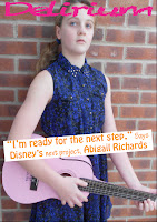
This is the first draft for the front cover. The cut out dresses and layout of the main coverline are good. To improve, I'm going to remove the yellow and orange font in favour of a blue, pink, black and white colour scheme which will run throughout the entire magazine. The dresses are going to be moved to the top right third so that the guitar is visible. The font of the masthead is also going to be changed so that it is bolder.
This is the second draft for the front cover. The movement of the dresses makes the guitar more visible, showing that it is a music magazine. The font of the masthead stand out more and the 'Chalkduster' font is more suited to the coverline, and making the pull quote and her name stand out more.
Since the third draft, my lecturer has advised me to make some changes. As such, I have added the white banner and lowered the main subject image to admit the banner to make the masthead stand out more and to prevent obstruction to the image.
For the forth draft I have added a banner at the bottom of the page because it looked bare compared to the rest of the page. It contains popular artists from the genre research, including Olly Murs and Jessie J. I have added small blue hearts onto the banner at the bottom using photoshop to design and colour it.
In this draft, I have made many changes to the front cover after I printed off the front cover in order to get a more accurate view so that I could gauge how conventional it was. The background image was changed in order to make Abigail look older and to have an elongated brick background, so that the semi-transparent masthead banner could be put in without making Abigail smaller. The first letter of the masthead has been changed so that it can be made into a logo that is placed on all of the pages of my magazine. The coverline has also been significantly shortened and the font has been changed, again to give the magazine a more professional appearance. The layout of the dresses have also been changed so that they are centred around a circular text box, as it makes it take up less room, and also makes it look more professional. I've kept the same colour scheme throughout and have also kept the majority of my original fonts.
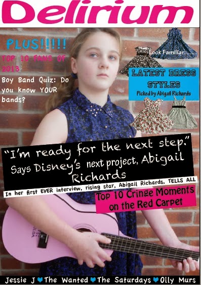
This is the final front cover design. I have added more plugs in the way of more coverlines. There is a mix of colours and fonts in order to keep it varied. The reason this is on the right hand side instead of the traditional 'left third' is because of the pose of Abigail, and placing all of the smaller coverlines would obscure her pose, as well as leaving a vast area of empty space. I have also adopted the use of semi-transparent backgrounds for the majority of the texts as it not only incorporates the colour scheme more effectively, but also makes the text easier to read against the brick background, something that I struggled with previously. There is no barcode because it would be on the back page of the magazine in order to save space.


